CITY — Global Food Festival @ UW
a
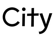
A playful, retro-inspired logo built around Seattle’s iconic skyline. The arcs evoke celebration and cultural diversity, while the bold script expresses warmth, connection, and joy.
Project Overview
CITY is a 10-week solo UX case study where I designed a student-led food festival that brings global cuisines to the University of Washington.
Through research, branding, and a festival-planning app, I aimed to make cultural exploration easy, fun, and affordable for students in Seattle.
The Challenge
How can we make Seattle’s diverse culinary culture more visible and accessible to students on campus? Seattle offers incredible food from around the world but most students stick to what’s familiar, limited by cost, time, or simply not knowing what’s out there. CITY is a design concept for a student-centered food festival that makes global cuisines feel more accessible and exciting. The challenge was to prototype a festival ecosystem — including a visual identity, promotional materials, and an event-mapping tool that:
-Highlights underrepresented cuisines and cultural stories.
– Encourages students to explore beyond what they already know.
– Balances excitement with cultural respect.
– Feels cohesive across digital and physical touchpoints.

Research
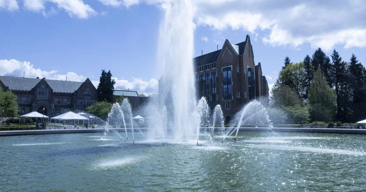
While larger festivals like Oktoberfest and Pizzafest thrive on niche cultural depth, CITY fills a gap by offering students an accessible, multicultural tasting experience right on campus. Its smaller scale, local roots, and interactive design make it both inviting and unique to Seattle.

Persona
Competitor Analysis

Andrew’s persona emerged from a key insight in my research: students crave cultural experiences that don’t feel like work. Many feel overwhelmed with school and just want to unwind, not schedule-packed or overly curated events.
This insight influenced major design decisions:
The festival layout was intentionally loose and walkable, encouraging spontaneous exploration.
Branding used soft, welcoming tones to reduce pressure and emphasize enjoyment.
The app concept prioritized flexible planning and users could discover events casually without committing to rigid timelines.
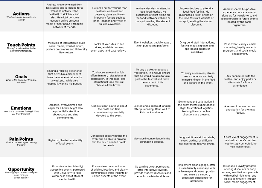
Customer Journey Map
To better understand Andrew’s experience, I mapped his journey across five key stages: awareness, decision, purchase, delivery, and loyalty.
This journey highlights Andrew’s emotional state and pain points—like event overwhelm, unclear pricing, or post-event disconnection—and how thoughtful design choices can address them.
These insights shaped several key design features of the CITY Festival:
Simplified ticketing & transparent pricing
Relaxed layout with low-pressure exploration
A map-based event app to reduce friction
By addressing student fatigue, social curiosity, and the need for cultural exploration, the journey map helped ensure CITY isn’t just a festival but a stress-free experience that students can connect with.
Branding
Logo
The CITY logo was designed to feel energetic yet approachable. The arc motif represents both celebration and global connection, while the urban skyline grounds the identity in Seattle. The bold, script-style typography brings warmth and casual flair, reflecting the festival's inviting tone.
Final Logo


Iterations
Typography
I wanted to convey a feeling of excitement, balance, and stability. To accomplish this, I chose a triadic color palette, which features Navy Blue, Teal, and Orange. This scheme reflects the feeling of excitement through the vibrant orange, balance through the refreshing teal, and stability through the grounding navy. Together, these colors create a harmonious yet lively atmosphere that is ideal for a festival setting.

#FF8C00

#002D72

#00BFA9
Colors
For the food festival poster, using Lobster and Lobster Two together makes the design look fun and creative. Both fonts have a cool, flowy style that gives a friendly, festive vibe which is perfect for a food event. The thick letters make it easy to read, even from far away, while still looking stylish. Lobster is more fancy and works great for the main title or headings because it grabs attention, while Lobster Two is simpler and can be used for the smaller details or subheadings, keeping everything clear but still matching the overall look. Together, they make the poster pop, making it attractive but also easy to understand

Main Font: Lobster

Secondary Font: Raleway
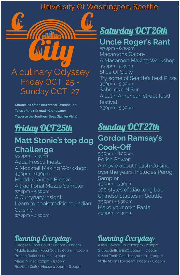
Final Poster and Design Iterations
To promote the CITY food festival, I created a bold, easy-to-navigate poster that captures both the vibrancy of global cuisine and student friendly atmosphere of the event.
I used the Lobster typeface for the main headings to bring energy and flair to the festival schedule. Its playful curves and script-like quality align with the celebratory tone of the event while maintaining legibility at a glance.
For supporting text, I paired Lobster with Raleway, a clean sans-serif font that ensured excellent readability for workshop descriptions, times, and recurring events. This balance helped organize the dense information in a way that was approachable and clear.
The layout emphasized accessibility and exploration: daily highlights were broken down by date, and recurring food court experiences were listed separately to help students plan around their interests. The use of orange, navy, and teal from my color palette added vibrancy, contrast, and cohesion with the rest of the brand system.
Final Poster

Iterations

Mobile App Design
Based on my personal insights, I focused on designing a simple and visually inviting app for students who are overwhelmed and want a low effort way to explore. The app highlights the upcoming artists, supports easy ticket access, and visually carries the same branding as the rest of the CITY experience.
This style tile establishes a clean, cohesive system for buttons and input fields across the app. Primary buttons use bold colors to highlight key actions, while secondary buttons offer softer contrast for supporting tasks. Each button responds clearly to user interaction through focused, hover and active states. Input fields follow a similar logic, using subtle color changes for hover and active states, and a distinct orange border and label to signal errors. Together, these components create a consistent and intuitive experience that aligns with the app’s energetic yet user-friendly aesthetic.

App Design


Style Tile & Visual Direction

Designed with feedback from user testing, they emphasize simplicity and accessibility. The home screen features a prominent search bar and highlights popular events for easy discovery. Users can browse event cards, view detailed information, and add items to their schedule. A unique conflict notification feature was included to help users avoid overlapping plans. Based on tester feedback, design adjustments focused on improving readability by increasing visual contrast and refining the navigation layout for a smoother, more intuitive experience
Reflection
This project allowed me to apply user-friendly design to a culturally rich, experience driven concept. Grounded in User Research, I focused on designing for accessibility, emotional context and ease of exploration. Through iterative feedback, I refined navigation, visual clarity, and interaction flow, ensuring the experience remained cohesive across physical and digital touchpoints. The process strengthened my ability to connect research insights to design outcomes.